Sunday, 22 October 2017

Urban marks, complete series.

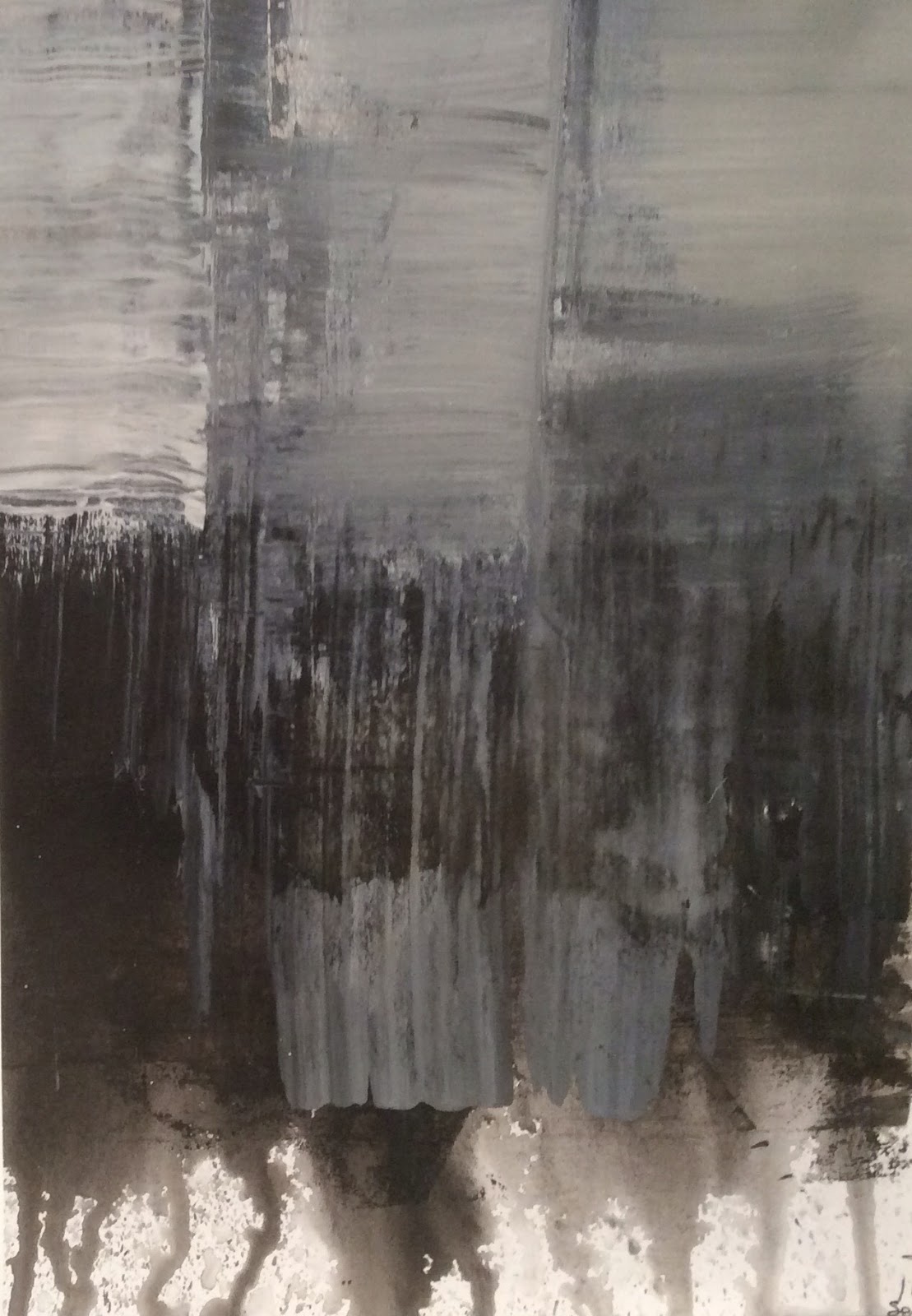
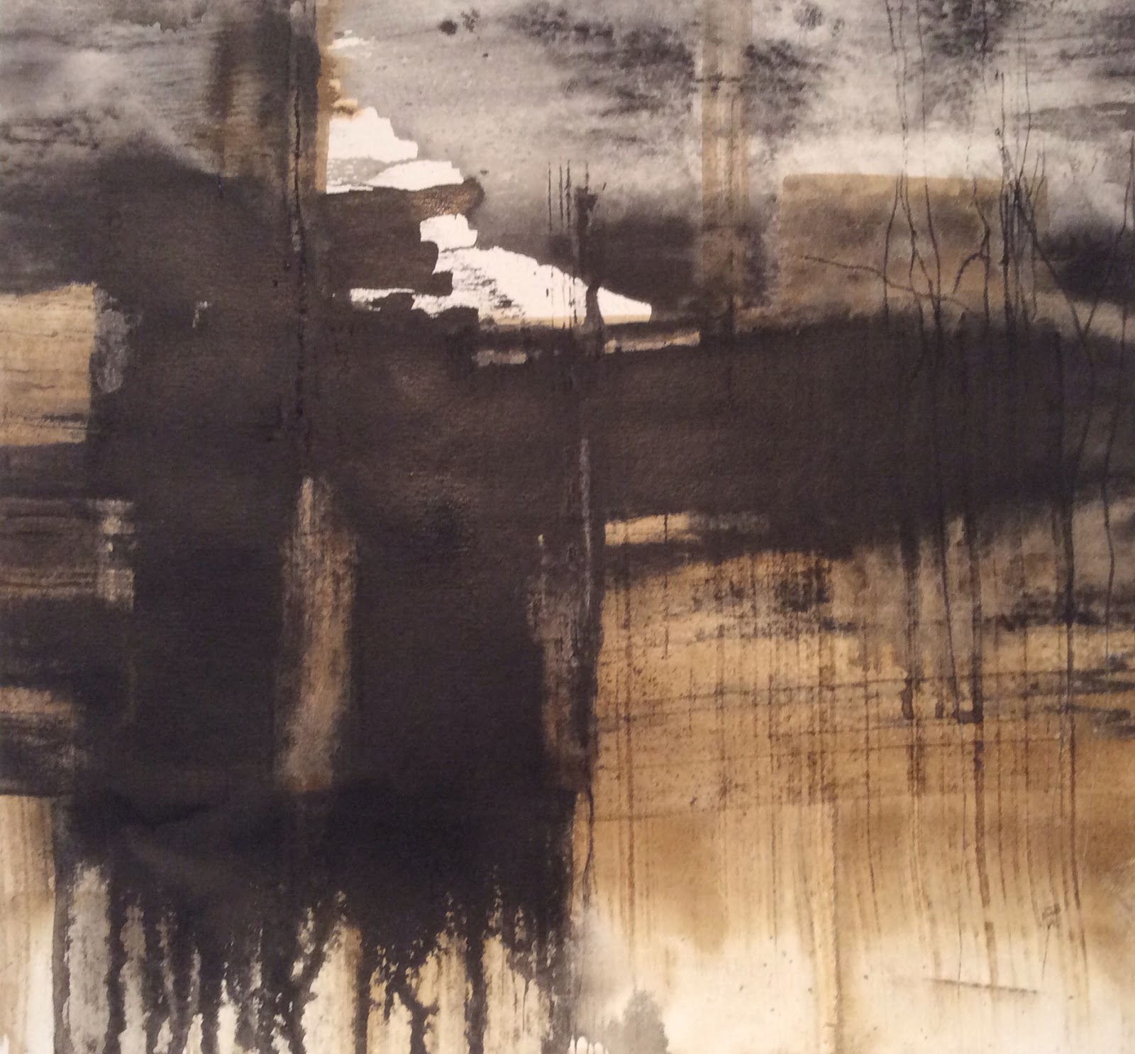
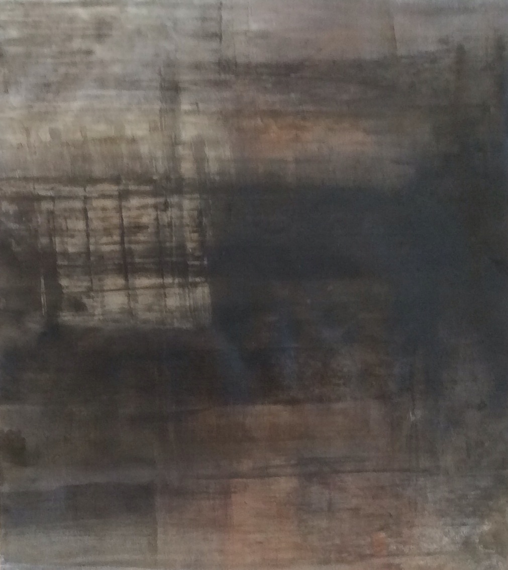
So, I have completed my 30 days of Urban mark making. Loved it, hated it and everything inbetween. Trying to critique the finished body of 30 days work....2 , 12 inch sq. Boards, 5 paintings on mountcard amd the bulk of the body of work, 38 works on paper, mainly print based but worked back into. For the last couple of days, I have been collecting the pieces together , photographing and recording them...still not sure about a lot of the images, they need some more living with ( was it Pollock that said accepting a finished pieces back into your ego is the hard bit and it so is with these...not sure why yet ! I am trying to get the works listed on Pinterest but the light has been and still is sooo poor. I have tried with spotlights but the colours in the work look unnatural and nothing like the real thing. As an artist, you are so only as good as the photographs of your art !

These are the works on paper...no titles to encourage you to create your own...
No 1. 21x22cm

No 2 ( below ) 21x21 cm


No 3 ( below)24x23 cm


No 4 ( below) 21x21cm


No5 ( below) 17x24 cm


No6(below) 17x17 cm


No7( below) 22x24 cm


No 8 ( below) 17x17cm


No 9( below) 23x24cm


No 10 (below) 25x28cm


No11(below) 28x29 cm.


No 12( below) 25x27cm.


No 13(below) 25x28 cm.

No 14 (below) 28x30 cm


No 15( below) 19x17 cm


No 16( below) 20x21cm


No 17(below) 19x27 cm


No 19(below) 25x20

No 20( below ) 27x24 cm

No 21( below ) 26x 28 cm

No 22( below ) 25x26 cm

No 23( below) 26 x 30 cm

No 25 ( below ) 30x28 cm

No 26(


Sunday, 15 October 2017

Urban marks (3)

So, continuing with the urban marks in any way I want, doing 30 days of urban marks. Enjoying the freedom of creating any kind of marks, some are turning into paintings in their own right, some are abstract, some are marks, hopefully with an urban flavour. I have kept working back into the pieces, can't leave them alone really ! These are today's, either new ones or worked back into ones.


Some are on mountcard, some on paper, some on Mdf. We will see where they go but I think they need recording now....I will use Pinterest for this, creating a board of Urban marks.

I am at this stage trying to keep the critiquing to the good points for fear of blocking the work. 
So, half way through the 30 days of urban marks I have reached some conclusions....

It's easier to create urban with black rather than bright colour.
I have enjoyed the freedom of creating something that could be a mark or a painting , a literal piece or an abstract piece.
I have liked working small
It's been a good excersise for me and it has allowed certain ideas to formulate eg it seems that there are a few natural small series of work eg paper work mounted with a wide mount and black frame, work on Mdf with a simple tray frame, abstract marks, glazed work, black and white ink work. Lots really. 

Saturday, 7 October 2017

30 days of urban marks (2)

Got lost in how many days I have been doing urban marks for. Loved it. Artists that seem relevant to day are ....Uta Barth ...Brett Amery...Mashiul Chowdhury...Marc Yankus.....

First one this week
Words that go with it...had white canvas syndrome, got panicky with the white, blank paper in front of me...( try over old work to counteract that )....it's the tones that do the work, even though I like the sepia...like the drips....like the scratches, hints of foliage, urban foliage....like the laers and the streaks....like the abstraction...am in areas I don't understand....carry on then....names...urban landscapes....urban ink studies ( too cumbersome )


Wet the pare, put in a mark of ink ( in this case, sepia ) ...play around thinking of urban.mmmm...like that it's only sepia with a tiny bit of black ink, like the pencil marks....like the different , diagonal marks of the pencil ( too many of mine are horizontal and vertical marks....have found a way to cover over marks that I don't like by covering them with white acrylic, seems to work.


Seem to be caught up with using sepia ink first. Interesting. I have enjoyed the warmth, rather than just the black. Try a paler one....in aw at it's easier to get a feeling of urban or industrial with black ink. I think of William Wray who amazingly gets the urban feeling with bright colours , a pink or turquoise. I have used this little ink applicator that I don't even know what it's name is, I bought them by mistake once so haven't really used them. I enjoyed the lines it gave me, more fluid than a pen but more controllable than a brush. Interesting. Will see whether I like this tomorrow, I have to majorly live with these.


I liked this one but just thought I would tweak it. Mmm...it turned into another image, below


Some of the marks seem like canal locks. Keep going without too much criticism....time enough to critique them when I have done 30. That will mean all October really.

Marks on mountcard....acrylics....inks....I like the marks that look like chimneys

Again chimneys.....liked the warmth from the burnt umber...again on mountcard

This one on paper, around the 12 inch sq. Size. It's a favourite today but that so changes....the paint / ink goes on the paper so differently than the mountcard. Keep trying. 


Saturday, 23 September 2017

Collages 7,8,9,10,11, Urban marks ( 2)

So, I have two strands of work at the moment....the collages and the urban marks.

The collages.
Slow, slow, slow....lots of thought, placing, reviewing, researching....recurring. What do I want from these ? Not sure yet, it's enough that it's a trip down memory lane for me, using my paintings on paper to make new work. I am still thinking of landscapes, but aware that when I twist or turn them round, they look mor abstract....just go with it...I like not knowing where they are going.

I had another go at this one....there were elements that have niggled me this week. I like to live with them for a few days before they almost come into their own or become seperate from me....if that makes sense....will live with it again now...


This one from last week re painted and some of the crunchy edges removed....I think I got a bit giddy with the crunchy edges last week, need to calm it down. Interesting ( to me anyway ) that I am keeping to a very limited pallette....that seems to be pleasing this week. 


Can you gave too much thought in a painting...?For me...yes you can...better sometimes to , ' think in paint. ' 


Added cotton canvas into these . I used to mount works in paper on cotton so I could display them like a canvas. It worked but not for long term display. It's nice to work with, will see what they are like when they dry, sometimes they die.


Urban Marks
This work is much more instinctive, intuitive work...what do I want ? A flavour of my a Urban world...love the monochrome. So, I started with a monoprint using a geli plate ( I had some really good results this week from bacofoil over mountcard ) and then rewet the block printing ink , adding sumi ink , varnish and white acrylic paint. I had been looking at the work of a John Virtue and for his big paintings he had used Indian ink, shellac and white acrylic paint, so worth a try. This one was 18 cm sq.


This was 21 x 22 cm sq. I wanted to explore the urban marks rather than produce urban landscapes.

Print off the geli plate, reworked. Don't know that this one has anything going for it but not deciding that for the moment.

Reworked 2 of the collages. Have gone pale, pale, pale. I like them though....today...

52 cm sq.


52 cm sq. Created as a landscape but much preferred it turned on it's side.


52 cm sq. This one felt more like a landscape.


52 cm sq. Went through a few incarnations.


Four together in the studio. Still unsure whether to title them as collage no 1,2,3 etc or give them titles. Loved the colours .

Sunday, 17 September 2017

Collages 7,8,9

The collages are slow.....the process is sooo slow....it gives you time to think....but sometimes too much thought blocks an artists flow ! So different than how I normally work, exhausting....but rewarding and exciting too.

Very into monochromatic work at the moment....it's from going back into the ink for the group....it's sent me down a different path....back to greys !

I have been looking particularly at the London paintings of John Virtue. Wonderful work. His large paintings were done with Indian ink, shellac and white acrylic....something to try....there were lots of prints too but not sure what type the prints were...more research required....he also numbered his paintings / pieces of art which I liked the idea of doing. Try it with the collages. He explained that although he might be up to number 735, that didn't neccessarily mean he had 735 paintings because some were destroyed.

This was first one that was finished , but it had lots of work . I had painted it as a landscape but wasn't happy with it the landscape way, turned around it worked for me.....

So, because this area of work is so new, I could easily be over critical and only see what I didn't like about the piece. It's better therefore....at this stage.... to only list what I do like about the piece....

I love the fact that it uses old work to produce new.
I love the monochrome....
I love the umber that warms the black slightly and the ochre the colours the white
I love the fact that the old paintings peep through in parts.
I love the crunchy edges that happen through layering the ripped pieces.
I love the fact that the piece is not square.
It was easier to create them on board with a frame on, the first ones were on Mdf and they warped. Maybe try just on hardboard if I continue with them.
So, this one is collage number 7.
It's hard to get as much of a feeling of depth with acrylics as opposed to oil. Mmm. I think I just need to keep going. 

I like....the ochre passages...the darker marks...the golds left from the collaged painting...the greyness...

I have mixed quite a few grey colours....love the mixing...

You can't see the texture properly on the photo...it's lovely....crunchy...dark...a little unsettling...organic maybe...it feels like a scar....it feels a little Modernist which I didn't want but that can be altered...it may be to do with the geometric shape of the collaged pieces....


So these three are drying out on the Art lounge chimney breast , where I can live with them and look at them....Although they started life as landscapes , they have moved away a little.....all will become clear ...or not as the case might be.....do more !